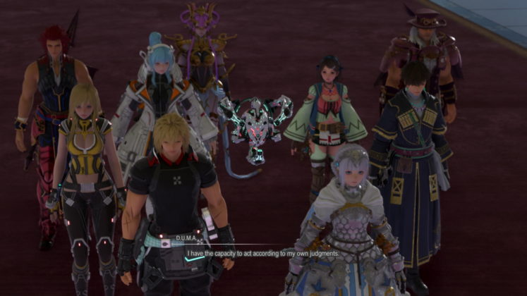
Developed By: Square Enix
Published By: Bandai Namco Entertainment
Platforms: PlayStation 5, PlayStation 4, Xbox One, Xbox Series X and Series S, Microsoft Windows
Reviewed On: PlayStation 5
Review Copy Provided By Bandai Namco Entertainment Asia
Welcome to space or in this case a vast space of lands to venture in this JRPG as Star Ocean: The Divine Force tried to make a remarkable return with newly revamped gameplay of exploration and combat. Star Ocean series to me has always been trying to be space-ambitious – sounding something new from the norm. A form of a Star Trek or Mass Effect venture where no JRPGs have ever thread before, so to speak.
Fortunately, Star Ocean: The Divine Force is definitely a step up from many previous ones, yet it doesn’t compare to Star Ocean: The Second Story or Star Ocean: Till the End of Time despite my enjoyment of the exploration of lush fields and fast seamless combat. It’s a slow burner that’s for sure, as things only garner some interest in the later parts of the game rather than capturing that moment for you right from the start.
However, here are many other factors that can be improved upon even more to make me fall in love again with this series. Venture forth as here is my review of Star Ocean: The Divine Force.
Gameplay – Full Throttle Ahead
At the starting point, players are given the difficulty setting and two main protagonists of Captain Raymond or Princess Laeticia to choose from that start you off with a brief introduction. Initially, players are given three attack combo buttons, square, triangle, or circle. Each has its own moves and three sets of combos that can each be set by pressing the start button on the menu screen. But things take a turn surprisingly better with the introduction of DUMA, a robotic sentient companion that straps itself to a player’s back, enhancing traversal in the fields and granting defensive flight during combat.
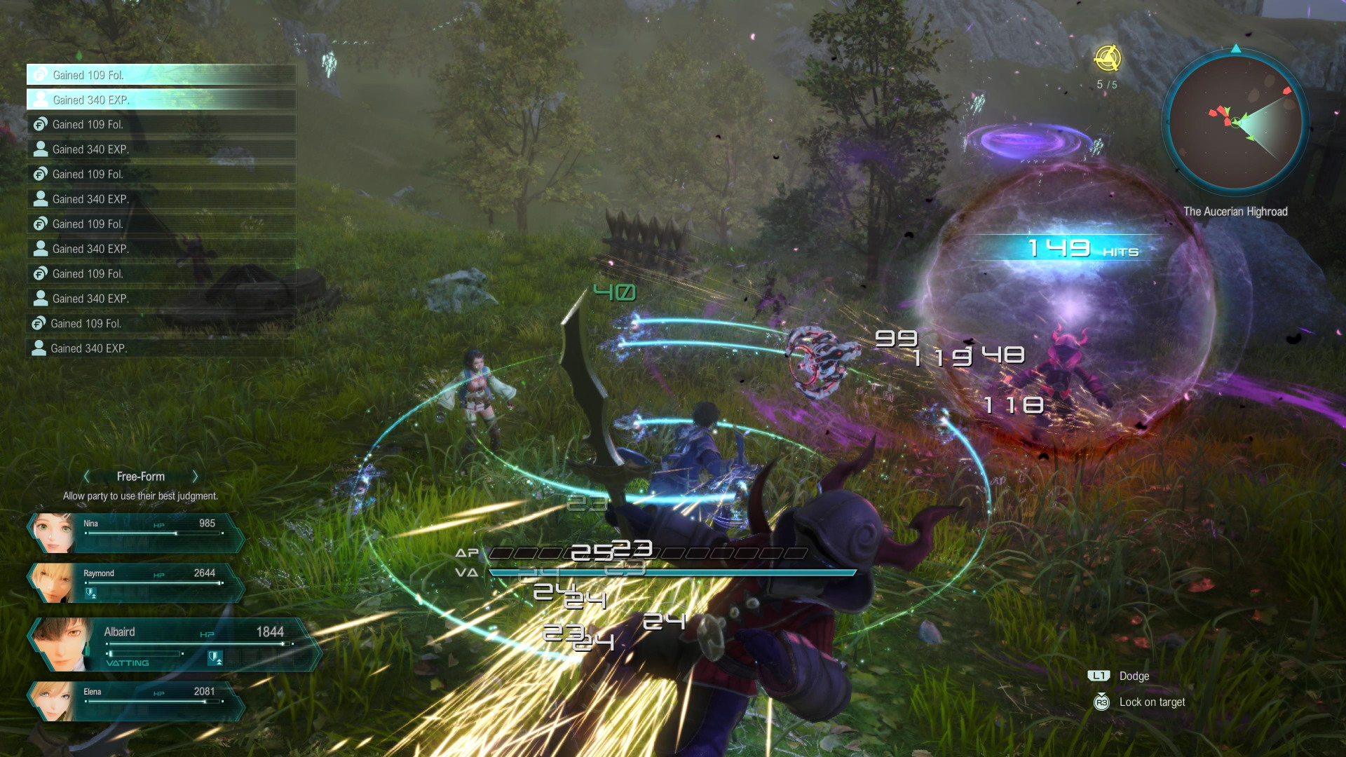
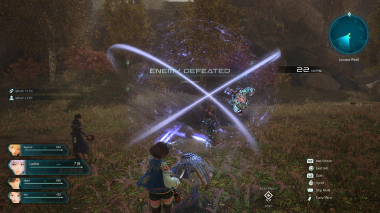
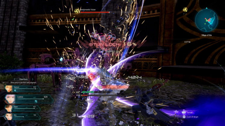
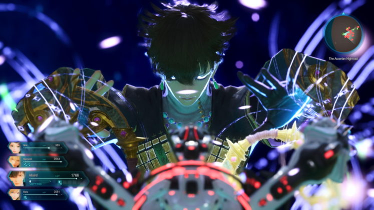
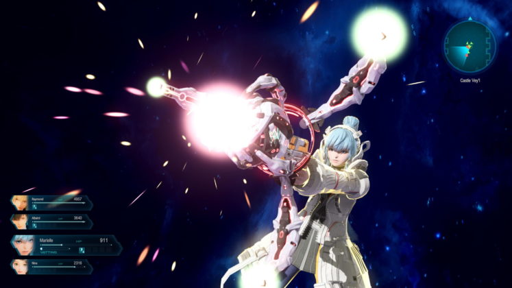
This is how I would describe the combat scene, fast yet frantic, as our main character is strapped onto a rocket that flies and lunges at the enemy at the start and during combat. Surprising enemies before and even during combat as our main character is able to float, survey, and dive for a decisive strike, like a mecha dive attack. When most enemies are surprised, they are also stunned aka blindsided, allowing them to be open to attack, and more AP (action points) is allocated to the player’s bar actions taken in real-time. Before the AP exhausts itself and waits for its recovery of it by running around or standing still briefly. Moreover, combat seamlessly starts and ends without any loading screen which is awesome. Visually, this turns into a bash of combos using AP where each combo differs to the types of characters you switched to seamlessly via the directional buttons depending on the combos you preset in the menu for each member. The gameplay appears to be a slash-and-bash of lightsaber swinging and bursting explosive actions on screen, almost akin to the Final Fantasy VII remake and Dynasty Warrior combined.
Over time during combat, it gets frantic too due to the fact that the third-person camera always closes in on the action rather than zooming out, leaving no breathing space, and is hardly able to perform a follow-up attack or combo even though the cursor locks on to target enemy. At most times, I ended up zipping through enemies and damaging them while doing so, but end up hitting air as follow-up attacks, or escaping the combat zone at the same time, respawning weakened enemies back to their previous locations, or by zipping through the edge and falling off, causing me damage and shame.
Fortunately, much later I found by accident that there is a stop mode by pressing the touchpad that allows me to stop time, pan the camera around, and attack again or use items mid-combat (the only way). The tutorial section explained stop mode in the menu options, but the tutorial itself didn’t pop up in the main game like the others or I may have missed it because the text in general is really small and hard to follow. At first, this stop mode function is not crucial to the game’s gameplay, which appears purely arcadey at first, but later on, after twenty hours of sinking in, as enemies become stronger – item usage becomes crucial to surviving as the JRPG elements come into play.
Other than the items, as you level up your party, they gain SP (skill points) per level up which is used to be carefully spent on gaining new skills via the skill tree, leveling up each attack/combo attack, item creation mechanics, and level up passive and active skill. Item creation comprises of each compounding, crafting, smithery, engineering, alchemy, authoring, and synthesis.
Apart from combat, Dumas is also usable to fly across the fields in exploration mode and can scan the environment for treasure boxes. When I was traversing up the mountains to pick up crystals to upgrade Dumas and treasures, it felt great at first, but later it became repetitive because, besides enemies and mini-bosses, there were no other aspects of platforming and lively design, so the fields feel barren. There’s not even a traveling peddler, outdoor merchant, soldiers, animals, or even wildlife to give the area a bit more sense of liveliness. This changes later after twenty hours when the fields are more designed in a linear fashion rather than being vast with a bit more platforming interactivity and puzzles. Additionally, the haptic feedback on my controller has only one type of vibrating feedback no matter what I do in the fields.
There are also compact towns that can be flown around with treasures that can also be picked up. The problem is that most towns’ inhabitants aren’t very interactive but are more interested in giving side quests, and are addicted to a mini-card game called Es’owa. A card game that loosely depicts the rules of the board game Go.
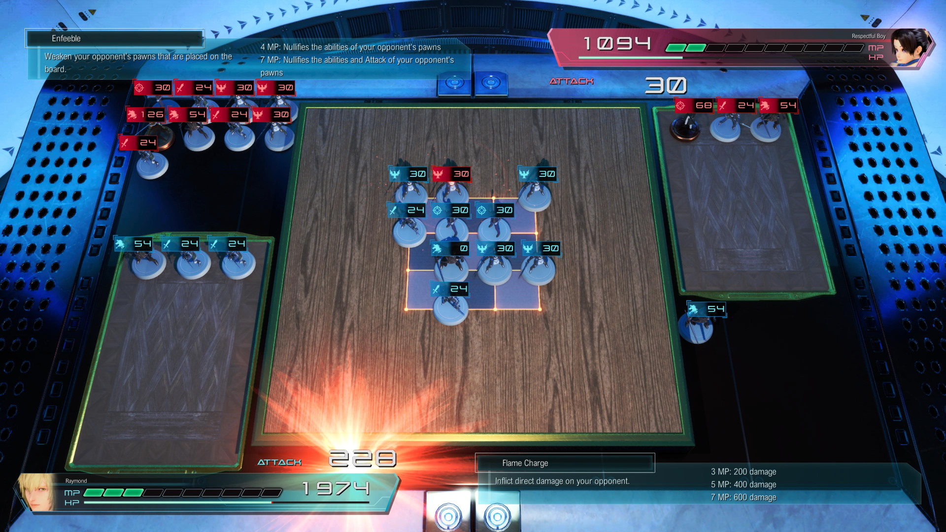
The thing is, neither of these kept me invested to get a sense of the world and worldbuilding, and there are very few rewards to incentivize it, except for an Item creation system provided by an NPC named Welch. There were instances in which some minigames and sidequests gave rewards, but again the text was small and brief for me to notice. In view of this, as the stats and skills are heavily dependent on leveling up, personally it is best suggested that completing minigames and sidequests too should also be an alternative way to gain more SP.
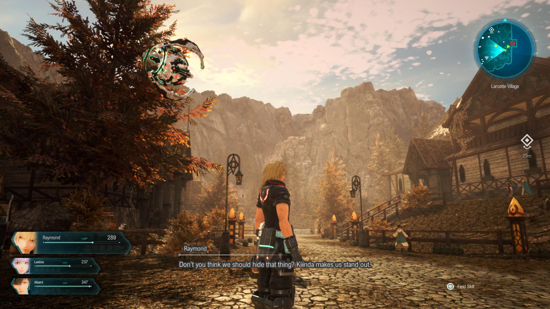
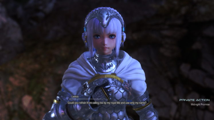
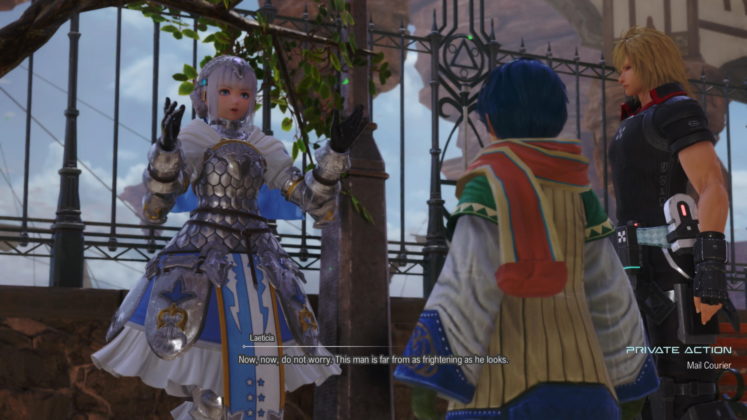
Going into towns is only worthwhile if you enter it again, disbanded, and engage with party members in private action segments. Besides the main story, this is the only segment that tells you more about your party members, their likes and dislikes, so to speak. As far as I can tell, these private actions don’t have any proper visible trigger points, affection bar, or prompts to indicate when and where they take place which appears pretty random to me. As I had to figure things out on my own in terms of SP spending, Item creation without recipes, and private actions, I felt it is a very traditional-based JRPG because I am too accustomed to the modern set of JRPGs of being spoonfed.
Speaking of disbandments, it happens pretty often in the main story that it unequips all the leaving parties’ accessories and I have to manually re-equip them each time they are back which is a major tiring hindrance.
UI Design – One Step Forward For Mankind, Two Steps Backwards
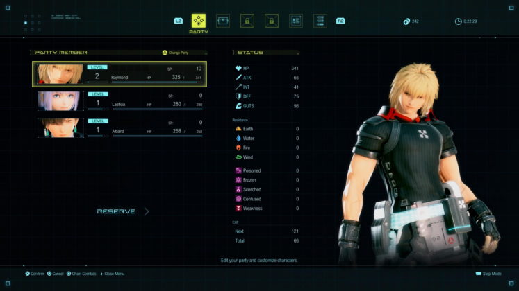
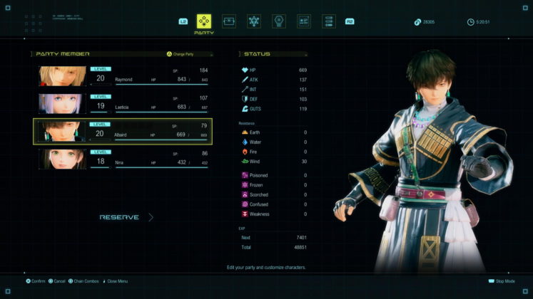
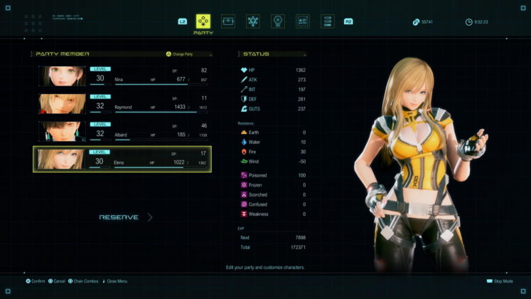
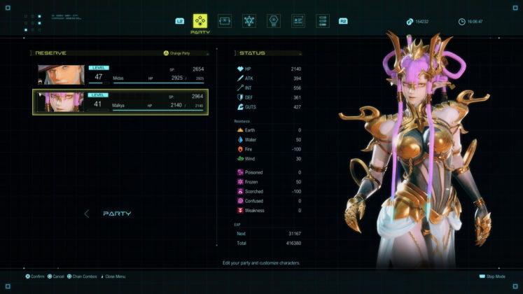
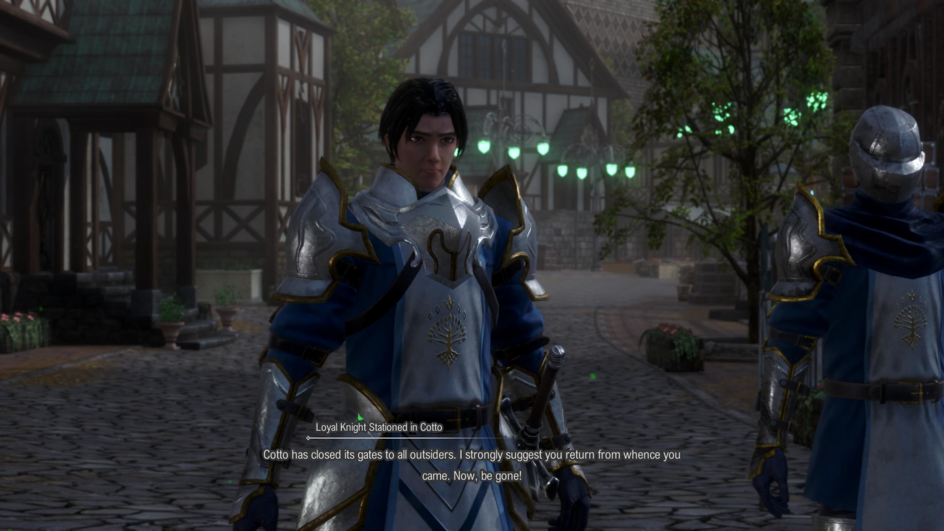
While I am glad there is an auto-heal function in stop mode, the UI design in general is by far the worst aspect I played in this game. While the main menu is designed like a star chart with a black background overlayed with thin line boxes resembling a form of 2D sea chart design. The text of currency, SP points, button prompts, and readability is placed far spread wide apart from one another and the texts are really small to be recognized even though it’s striking white in color. The text size is none adjustable in the options menu, leaving it really difficult to read, accessibly unfriendly, and less cohesive in the player-view experience. I will need to look around thrice before finding what I need to read and reading it by squinting my eyes. This text small issue directly also extends to rewards after completing combat, side quests, minigames, and cutscene cinematic which appears niche at first but collectively affects my experience as a whole, making me feel old.
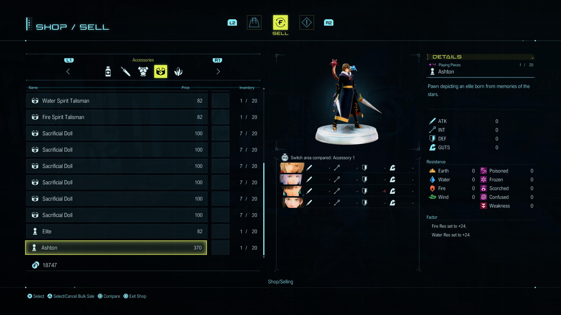
As the main menu does have a good amount of glossary, items description, and tutorials to catch up. The side quests and fast travel on the other hand are only accessible in the Map Menu by pressing R2 (not visibly prompted in the UI as well) instead of being available in the main menu which at first left me awfully dumbstruck. Moreover purchasing items from any merchants do not have mass buy and mass sell options (no pressing up/down directional button) which makes everything manually done one by one via the left and right directional button which is a huge blunder.
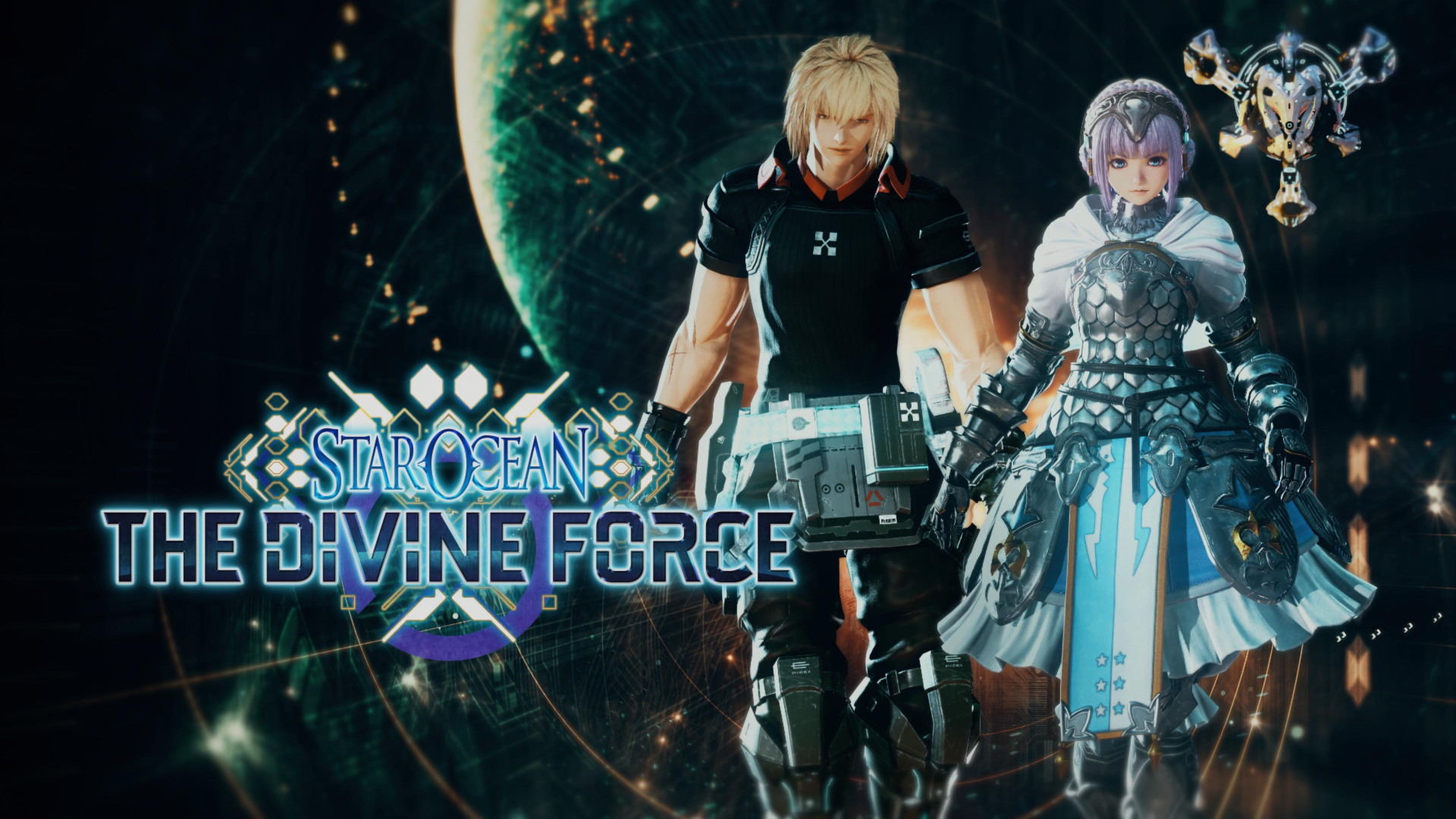
However, the character 3D models and item model designs presented in the main menu are really well-made and detailed, unlike the game’s cinematic counterpart.
Cinematic, Characters, and Level Design – Inconsistent Designs Throughout
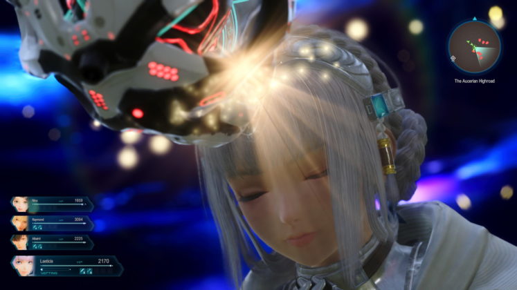
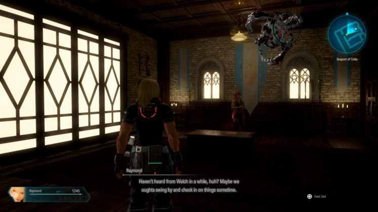
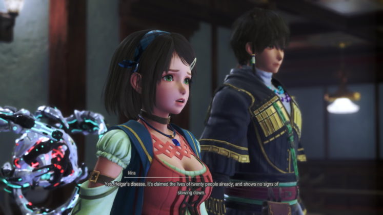
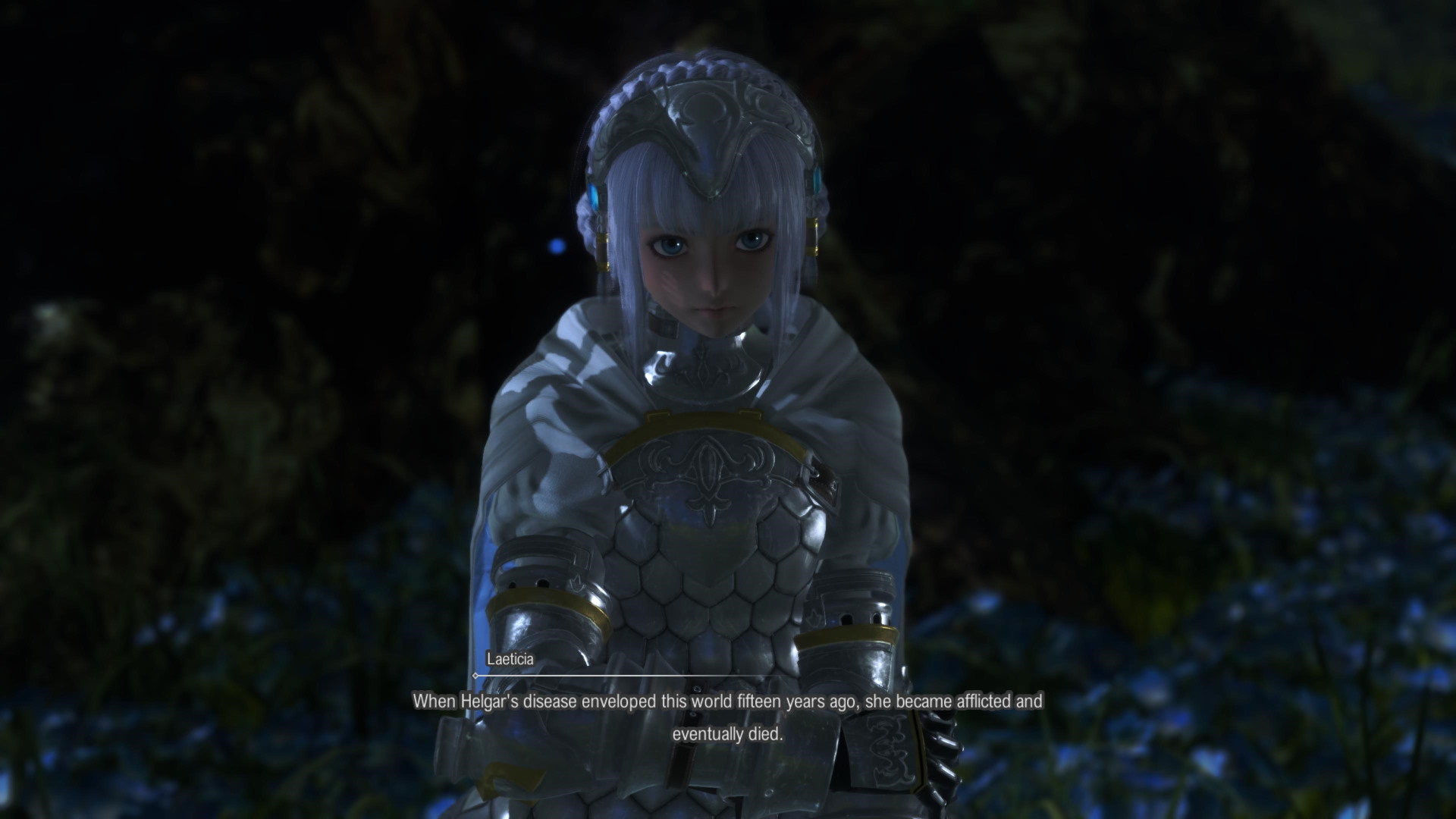
Unlike its main menu 3D model designs and art cover, most of the characters presented in the cinematic cutscenes are stiff and expressionless conflicting with their voiceovers counterparts’ delivery. With clothing folds flowing oddly with mild signs of broken hand (Raymond) and the top layer of jacket bloating itself (especially Marielle) out of proportion, making her do a mild T-posing throughout every scene. While a few other characters are presented slightly better than the rest of the crowd with better lighting, sharp edges, and better camera blurring controls.
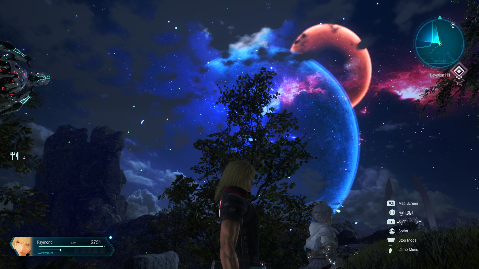
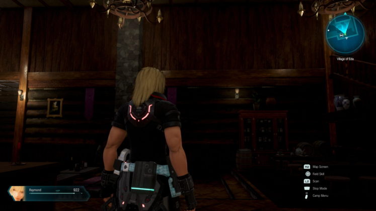
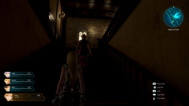
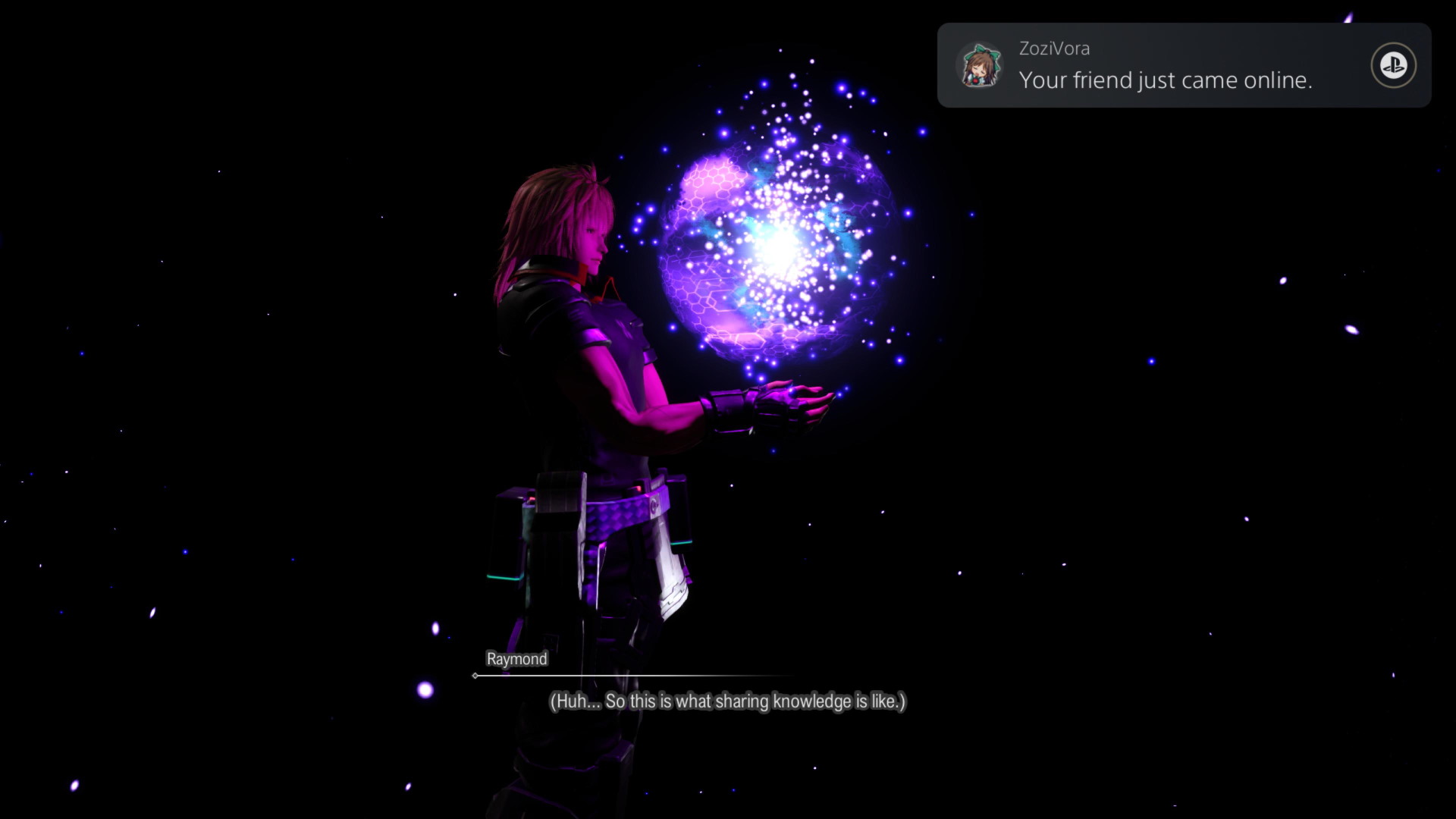
Most of these cinematics are either too blurred out in cameras on both main subjects and items or too dark in lighting design in the background as the level design too affects the cinematics too in general – making it look like I am in the dark ages. So much so that the fabrics in cinematics, tables, and wooden textures looks outdated and have strong image noises as the camera goes by. This also includes most shadow textures that ended up as dark dirt clots on the character’s skin and background.
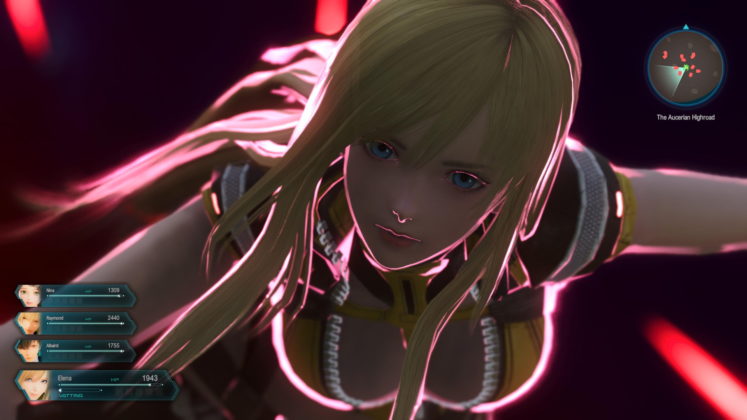
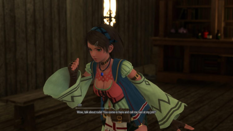
This is also more obvious as a character that goes by the name of Nina has more detailed efforts compare to other characters in all cutscenes with more details, exuberant fabrics, and a pinkish reflective hue to her skin, making her even more likable.
Others will be presented as stiff, less reflective 3D models with blur effects smudge on them, making them look sorta outdated, oddly dull, yet dreamy look including their hair but more like a ball-jointed doll. Looks to be really biased as every character design, lighting and place appear inconsistent in every scene.
In terms of level designs, some places in level designs are compact but spectacular and breathtaking while most others such as vast plains look barren and empty. Added that some tight places have a huge dip in framerates, causing stutter on the screen as this is more noticeable while running in a dungeon or underground cavern areas.
Storytelling – Mundanely One-Sided
Unlike its combat, the storytelling in this game is slow-paced yet brief at a linear pace manner and doesn’t exude much personality needed to make me grow in love with most of the characters. Things just happen briefly without the right pacing, dry script delivery, or in this case lack of easing the icebreaker needed to allow for more digestion of who’s who and what’s what. In a way, I feel that we are all just mutually joining each other to help each other (party members) just for the sake of it rather than leaving out many other contexts to solidify the reasons. For that reason, allies, NPC’s, and enemies are introduced pretty briefly and quickly before joining one combat to another until I forgot who was that or what was going on. As for the enemies and bosses, they seem to keep coming at it for more rounds even though they lost earlier on, which gets repetitive up until the end without a clear explanation of why or what they do like aka Team Rockets in Pokemon. As a result, I care less about the story and invested more in what happens next in combat towards an endless loop.
While the greatest weakness of online multiplayer games is the lag, the greatest weakness of single-player games is the feeling of being disconnected from the party’s personality, it’s NPCs, enemies, and the sense of the world. While having an alien (Raymond And DUMA) in the party, there were fewer reactions from the surrounding parties and NPC’s on the way they dress, an orb floating around, and technology gaps which presents a certain dilemma that the story does not know how much potential it could bring to garner a cultural sense of exchange to both interest and educate players about symbology, semiomancers and more.
At times, there were certain interesting topics presented in the main story, and speaking with party members in private action such as more plagues in the future due to technology gaps, android/robot learning to be sentient and Laeticia’s attempts to understand Raymond’s culture may come across as comical. However, these topics were merely touched upon are but a few followed by glossing it over by having other topics such as upcoming boss fights. It wasn’t enough to develop more interesting holistic grounds to me and understanding between one another. Moreover, private actions are hard to pull off unless I plan to revisit every city and town after one boss fight or each cinematic.
Things happen so briefly in fact that previous ordeals of the main storytelling gets pushed aside to fight a war or political agendas mixed with later on with alien interventions. To the point that even the surroundings, environments, and the town NPCs are not affected by the grander schemes of things such as war. Hence leaving things felt detached and lack of a sense of urgency.
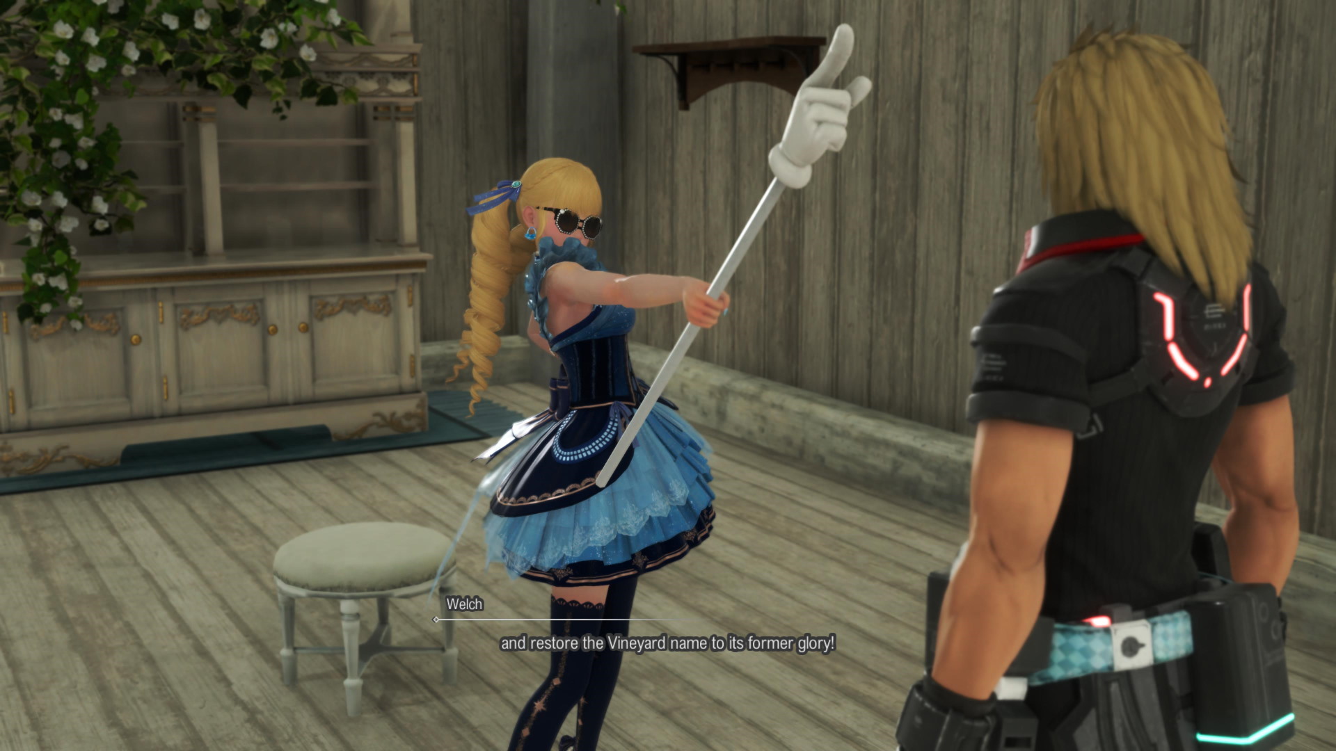
For example, there is a great plague or war going on in the cinematic but in-game every NPC in town is still doing their daily stuff without a care in the world and talking about playing a board game all the time. It’s as though they are so obsessively addicted to the board game, nothing else matters. To the point that I find talking to NPC Welch to be the most entertaining in my whole playthrough.
After twenty hours, things just switch over to a slightly better story, a bit more interactive NPCs, and less blurred cinematics; however, the path laid out is even more bare-bones with a more linear design and less expansive than before. But by that time comes, my mind just shuts off about the story because the repetition loop is still looping in my mind.
Sound and Music – Delivered Harmoniously
This is one of the best parts of the game that I find myself enjoying the most as the musical notes hit a decent score of strings of a harmonious flow of pieces in many different places and terrains. Some of the many instruments such as lute and flutes hit the plain ground including some vocals in between that give the right vibes of the place and it’s pretty enjoyable to listen to. This is even prevalent when combat hits hard with its rendition of fast rock tunes with electric guitars to keep me hyped up or dramatic cutscenes with mostly piano pieces being played to set the right mood. Even to the point of drums and percussions are softened in tune to carry me over to the mood. Additionally, some soundtracks hit a nostalgic home run by taking me back to the days of Star Ocean: The Second Story just by listening to them, and others just take me to space adventure despite the fact that I am in an underdeveloped world. It’s really obvious that much effort and care is being placed into this department.
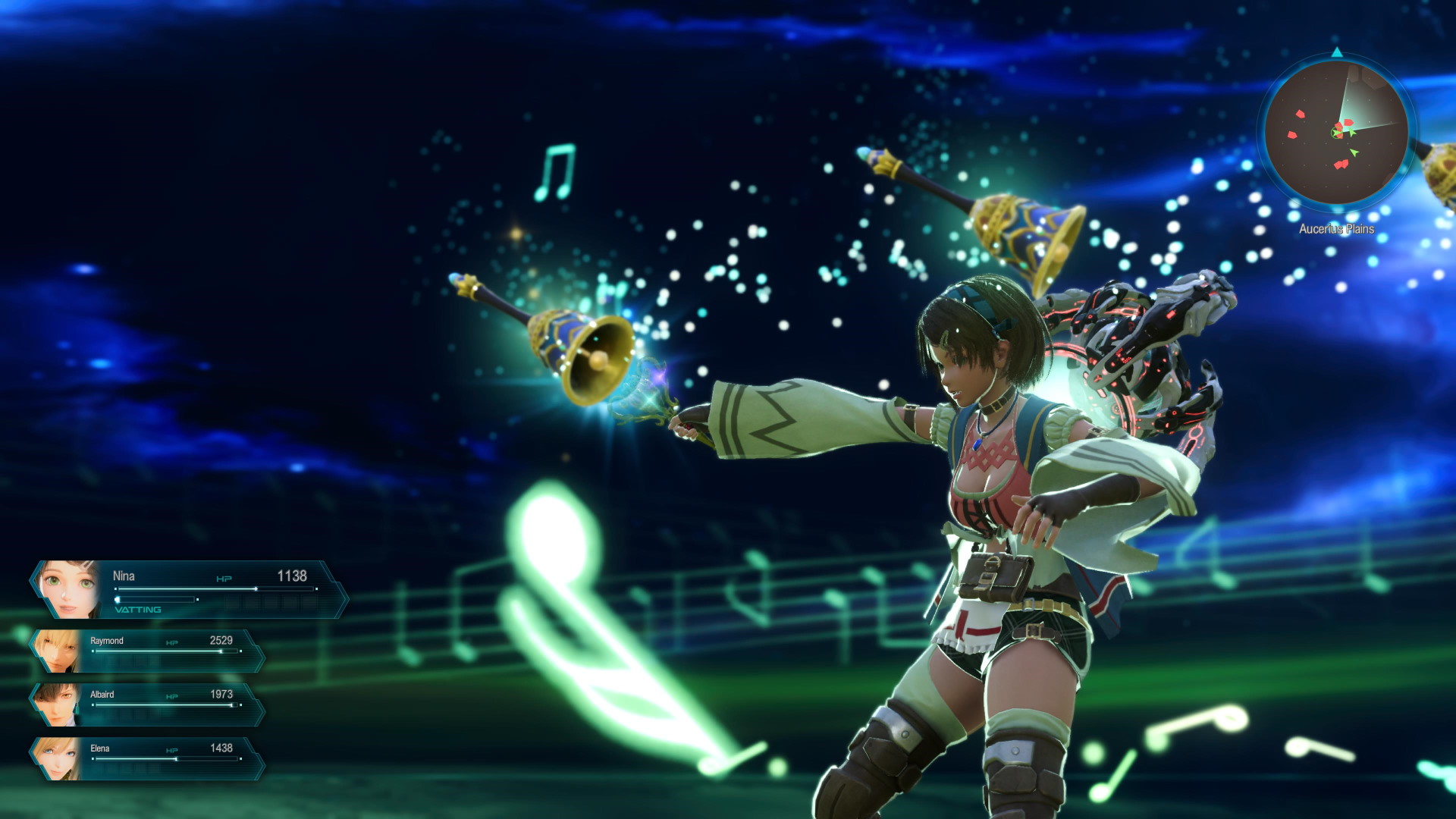
While Japanese voiceovers are decently done, it is best to play them with English voiceovers, since the subtitles displayed are too small to properly connect the dots as the lines are spoken. While the English lines are delivered ruggedly in the sense, suffice to say English voice acting is more distinct enough to exude enough character personality on their own compared to Japanese professionalism, which seems to have everyone delivering the same manner of weatherman/newscast quality. Sadly, you cannot change language this in-game, but only when you start a new game.
What I Liked About Star Ocean: The Divine Force
- Exploration with Duma – Nothing beats flying around like Peter Pan
- Combat with DUMA – Lunging into combat like a mecha combat. Combat gets better and harder after the twenty hours mark.
- Combat flow – Fast, seamless, and simple combo executions. Seamless switch to party members too
- Stop Mode Menu – Allow to stop mid-combat, assess combat, and use items. Outside combat to auto-heal parties.
- Music– Decent delivery of music with some nostalgic factors to Star Ocean: The Second Story. Good voice works in both Japanese and English.
- Ingame Menu – Good 3D models of characters, a good amount of glossary, items description, story recap, and tutorials.
- Traditionally Designed – Item creation and SP level points allocation is completely up to you in figuring it out manually.
- Best NPC to talk to – Welch
What I Wished Was Better
- Combat camera – At times the camera closes in if there is an object infront. Things just get hectic, jitters, or spin through an object. Some enemies do get stuck in or on walls, and reaching them is a hassle.
- Haptic feedback for PS5 controller – Felt flat and just vibrates in one type of setting instead of walking on different types of textures.
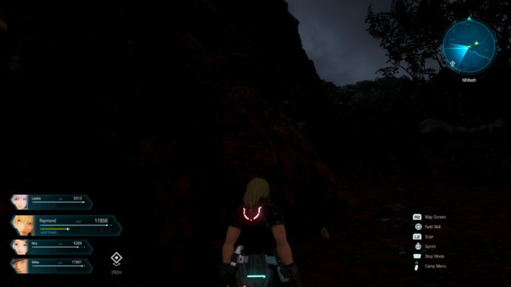
- Exploring the world – Most of the vast grassy plains felt really empty and barren while some nighttime fields looks muddled or darkened. Dip in framerates when exploring dungeons or caverns. Added sometimes party members get stuck in walls or on poison floors.
- Character design – Most characters in games (except Nina) and cutscenes lack expression, have bad plastic wigs, are purposely blurred out, and lack details, similar to mannequins being designed or ball-jointed dolls. During the night, the skin color of characters is also muddled and tends to blend into the darkened environment rather than reflect and stand out a bit more. It appears biased as some character such as Nina looks great in both cinematic and in-game.
- Level Designs in lighting – Poor light designs in most indoors, affecting cutscenes.It appears biased as some level designs is nice lit and perfectly made.
- Storytellling – Felt detachedly briefed, dry delivery, and repetitive with a lack of proper ice-breaking introductions, and previously defeated returning bosses felt very annoying (cringe).
- Cinematics – Odd blurring out necessary details on both subjects and places in cutscenes. Odd shadow dirt clots on both subjects and places. It appears biased as some cinematic is nicely done.
- Texts are just too small – None adjustable, majorly kills off cinematic (Japanese language), menu design is too far apart to line up the details and unnoticeable rewards in a sidequest, mini games, and combat rewards.
- Ingame Menu – Fast Travel and side quest details are only accessible in the map menu (R2) and it’s not prompted in the game except in tutorials.
- Merchant purchasing and selling- No mass buy and sell options.
- Main story disbandments from party members – Always unequip accessories when they returned all the time, causing me major irritation.
- Worst NPC to talk to – Others (and their card games).
Verdict – When A Project Is As Hurried As Its Combat
While I would love to recommend new traditional JRPGs, unfortunately, this is not one of them on the list of Christmas presents to give in its current state. Although there are some good moments be it vast level designs, music, few lines delivery, cinematics, and fast combat. These moments are far in between and progressively overshadowed by detached storytelling, bland in-game characters with stiff expressions, blurred cinematics, barren lands, dark-level designs, and small texts. While all this starts off as niche issues, collectively as a whole, it further dampens my experience. While on other aspects, I do enjoy some levels of exploring, the item creation system, talking to Welch, and SP leveling without any hand-holding. Eventually, towards the end, I have lost touch and interest in the story, the world, and its rewards. Despite this statement, I really hope that most of the issues can be patched up as soon as possible to provide a better experience for those in the future planning to pick this up too.
