Developed By: Blizzard Entertainment, Vicarious Visions
Published By: Blizzard Entertainment
Platforms: Playstation 4 & 5, Xbox One & Series, PC
Reviewed On: PC (Battlenet)
The name Diablo itself speaks volumes. A name that became a genre by itself much like Dark Souls that started the ‘Soul-like’ genre. Anyone that came from the Babyboomers to Gen X would definitely come across Diablo if they find themselves venturing into the path of gaming.
I have a confession to make, I have not played the original Diablo II long enough to recognize things in Resurrected. I had a dismal spec of a pc that could barely keep the game stable enough even during combat.
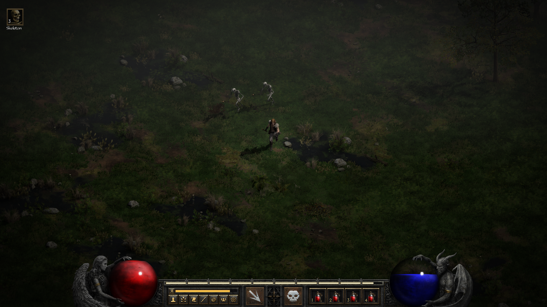
My experience ended with an undead killing me which took 10 seconds to be visually confirmed. So when Diablo III came, it was a blessing for me. Since then, I was able to own a console and decent gaming rig, I was able to finally enjoy a Diablo game without any hitches.
Diablo II: Resurrected (D2:R) came at a time where many of us have gone through the changes the genre has gone through. Diablo III itself made changes that were geared towards the change 14 years after the original.
Many other games such as Torchlight, Path of Exile, Dungeon Siege, and the likes have added their own twist to the genre which gives it a fresh experience. D2:R, to me, feels like a right remake that just came out at the wrong time.
What Has Changed
On the surface, D2:R looks amazing. The visuals are by far the best rendition for a game that is more than a decade old. Furthermore, it even has a toggle button to change back to its original retro look and the transition is a joy to watch.
The character models never looked better. The detail on each face is so well detailed. From the wrinkles on the Necromancer to the veins on the hands of the Amazon. This is visual value-added for a remake especially a game coming from the pixelated age. While the looks of some of the classes may not be to anyone’s liking but that is a preference matter.
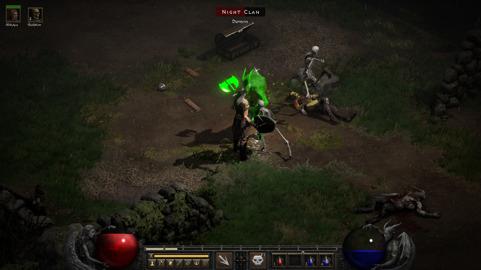
The textures on the map such as foliage are sharper. Although, I can’t help it that the game has too many shadows and it can get a little too dark to see things clearly especially in dungeons.
In addition, dropped loots sometimes can be a little hard to notice especially armors and certain weapons. While you can press and hold the Alt key to show the names but it just does not sit well with me to keep relying on a key just so I can be selective of what I need to pick up.
New Look, Old Problems
While the visuals deserve praise, the other quality of life aspects on the other hand needs some work. I can clearly understand that the game wants to stick faithfully to the original but there are some that can be changed to enhance the experience.
For instance, there should be an option to toggle the need of having a stamina bar. It can feel quite a slog especially when you may have a tendency to explore every nook and cranny of the map and you wish you could run around faster to do so. While the stamina bar charges overtime but it breaks the pacing altogether. This is more apparent, especially you want to zip through a certain dungeon.
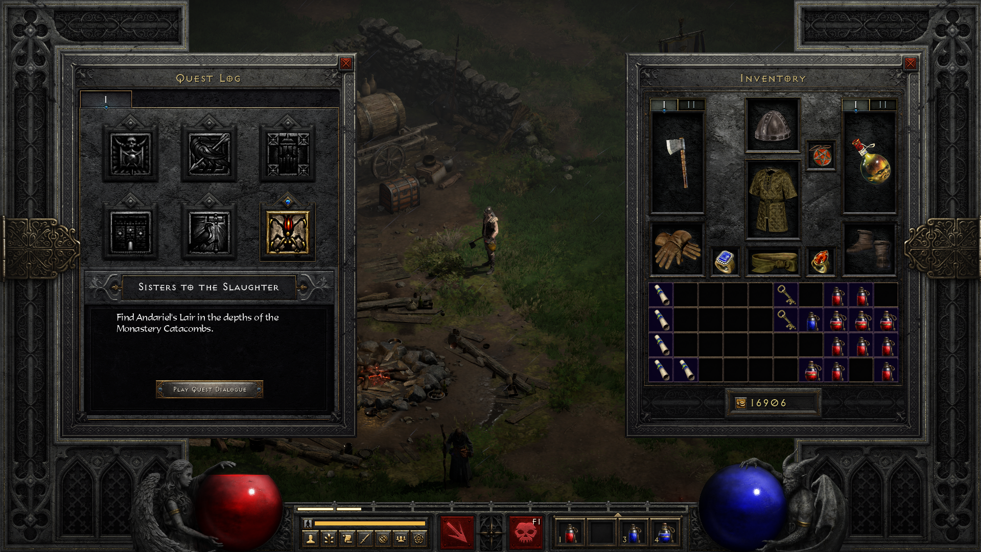
The game can actually do without the stamina bar because it isn’t exactly part of the combat mechanics. This is not Dark Souls where their stamina bar is largely part of the core combat mechanics. You can’t make unnecessary movements especially up against bosses. However, right here, there is no strategic role of the stamina bar in the game other than just being a plain nuisance.
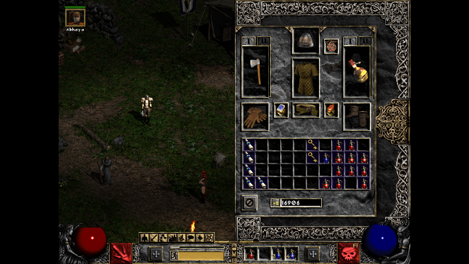
Another feature, I wished they could’ve added is an auto-sort inventory method. While D3 does not have it but item sizes were smaller and potions are stackable. Hence managing is less frustrating. The majority of equipment like helmets and boots takes up quite a bit of space in D2:R. This results in travelling back and forth to sell or identifying items as a hassle.
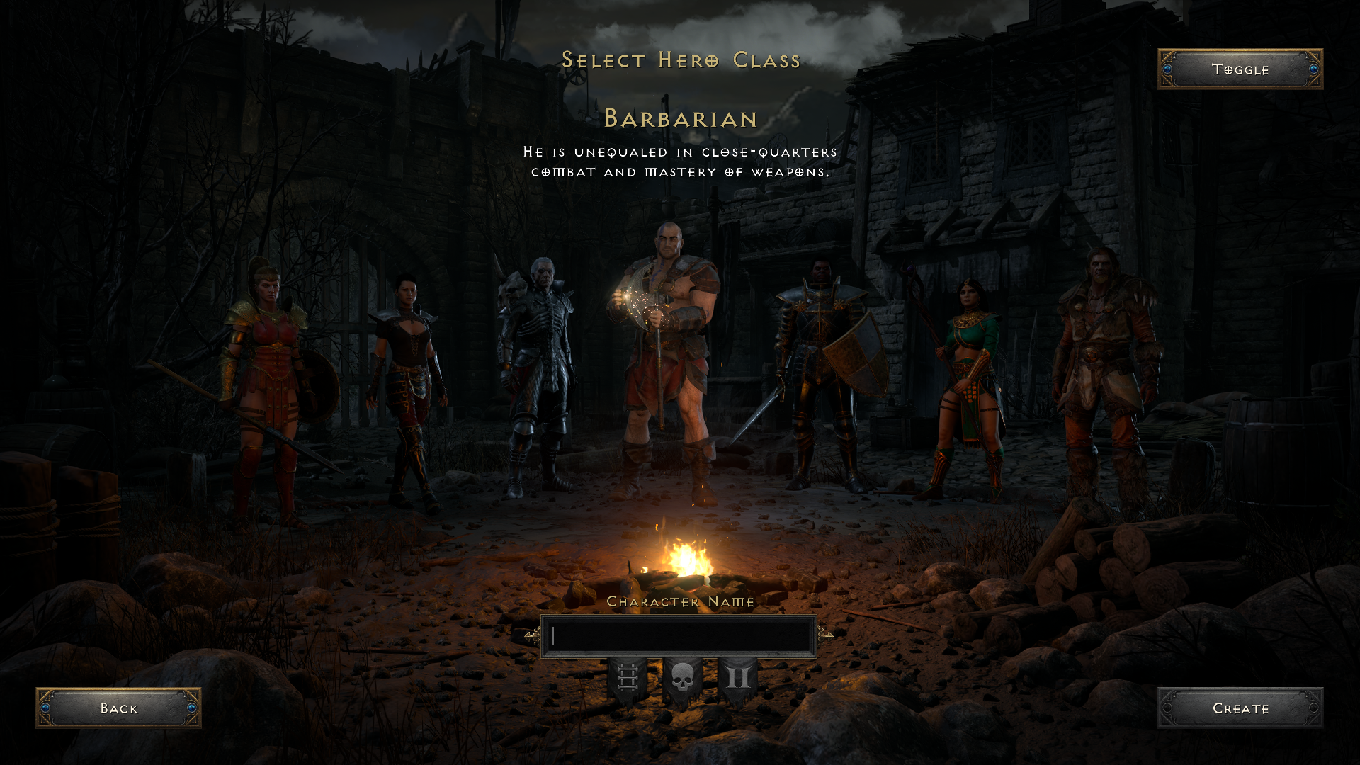
What saddens me further is the fact that upon switching to my DS4, I have the ability to auto-sort items by pressing the R3 button. While the auto-sort is rather wonky – it sorts things horizontally only but better than not having any. It is a total blasphemy that while PC has more keys to map, there is no dedicated key for auto-sort.
Old UI, Good New Support
The User Interface (UI) definitely shows age. This especially shows at the Quest tab where info comes in a sentence or two. While you can replay back the voice dialogue for an added story-telling touch, but the clarity can oftentimes be muddled in between the lines. Nonetheless, let’s face it, there is a good chance many might skip through the dialogue.
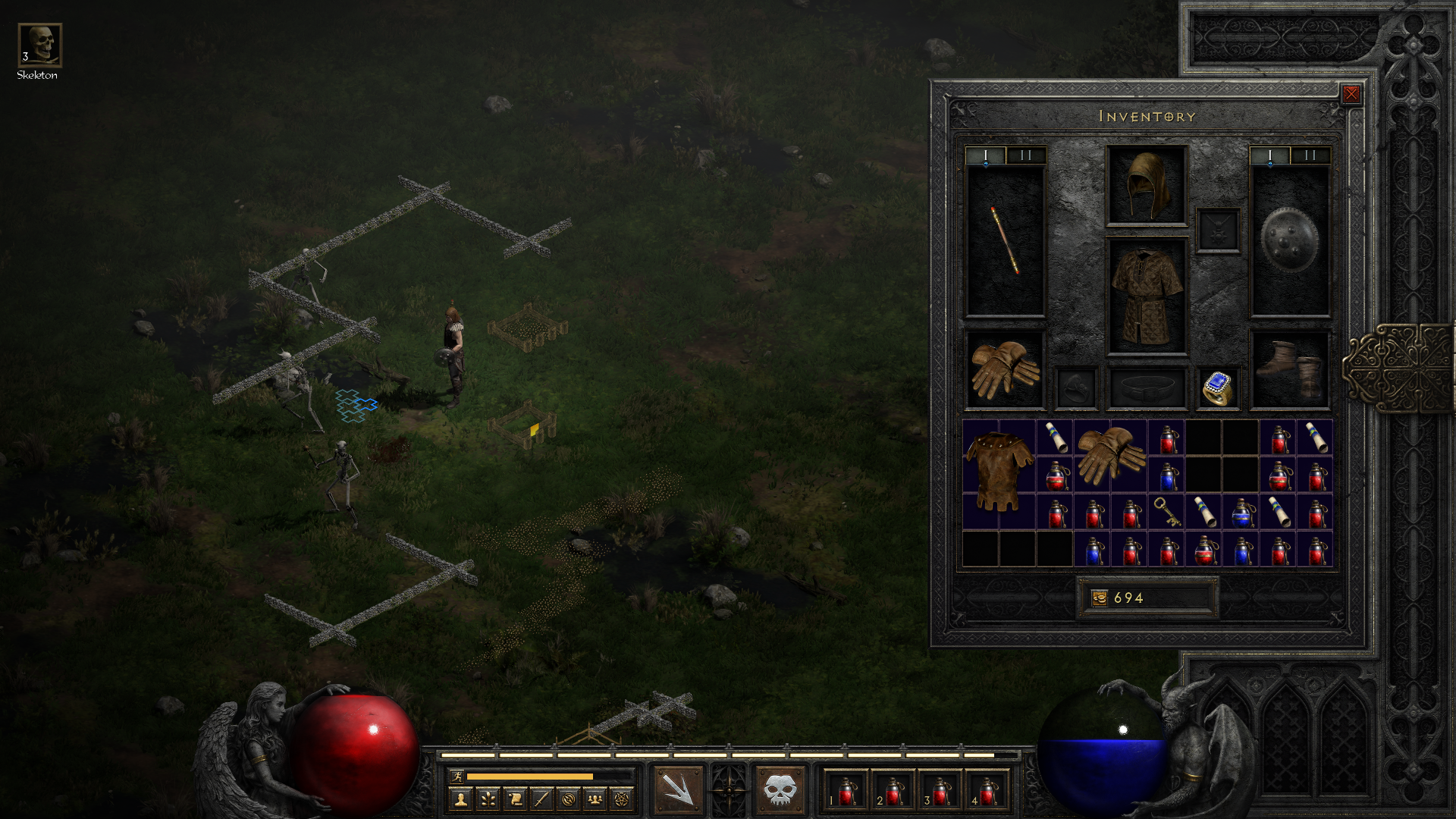
However, if the aged UI isn’t to your liking, you can plug in your DS4 or Xbox controller which the game will automatically detect. It also changes the button looks corresponds to which controller you hooked up which is pretty cool.
This will change up the entire UI to a much more modern look. While it does not change every menu – the Quest window still looks the same, but the inventory window and the skill bar are totally changed which gives it up much-updated look.
Good support includes bad nuances
The control layout remains largely the same albeit with slightly different button mappings. However, one thing that will stick out like a sore thumb is the skill bar.
The assignment of skills is very cumbersome. It baffles me that while you can assign skills on the F keys, there are no hotkey slots. You can only switch the skill on one slot to use them. This brings the motion of casting spells and attack skills rather unsmooth.
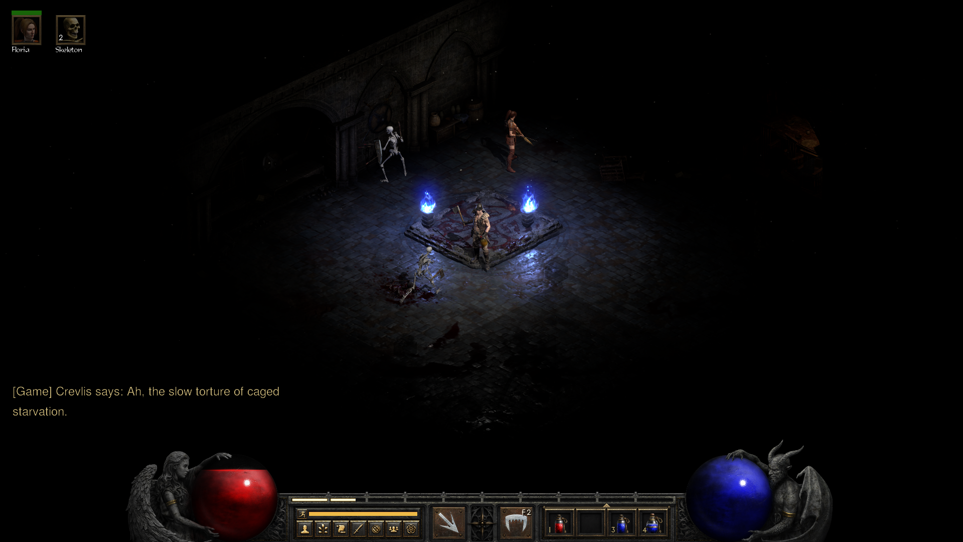
However, switching to a controller brings the hot key feature, and not to mention playing with the controller feels more natural. You get the feeling you have much better control, especially with melee attacks. Meanwhile, PC controls can be a hit-and-miss affair.
For instance, hitting an enemy with the left mouse button can sometimes end up moving your character instead of attacking. This was frustrating especially when you are dealing with a group of enemies.
While playing it with the controller is the best way in my opinion. However, that alone has some issues which I have not been able to resolve until now. Firstly, moving the right analog stick triggers the circled cursor to appear in a flickering manner. It gets annoying especially when you are in combat.
Furthermore, pressing the melee button also opens up the chat window. I was so frustrated at this. I have scoured the entire options menu and I can’t seem to find a way to prevent this. I hope a patch will be able to address this as soon as possible as I believe there will be players who wish to play it on a game controller.
Thank God For Multiplayer
The original D2 has split-screen multiplayer but on D2:R, the split-screen feature has been removed but there is an online multiplayer. My experience with the online has been rather good. The connection between myself and my friends has been smooth. I have not encountered any performance hiccups like lag thus far which was a very good thing.
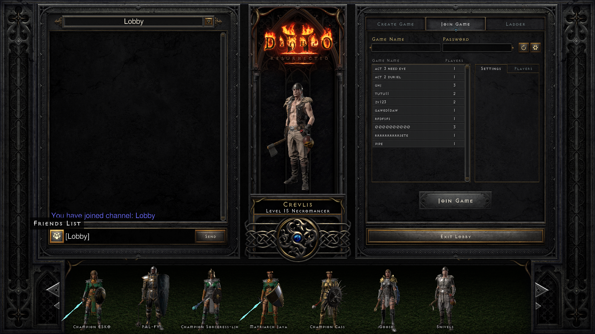
Although I had to admit, it took me a while to find out how to connect to my friend’s session. While the online multiplayer has its own lobby section but the entire layout of it is just not user-friendly.
My initial thought was in order to join a session I had to search for my friend’s session through the list at the lobby which is rather troublesome until I found a much faster way. You can join your friend’s session immediately by pressing on the Friend’s List button that was tucked away at the side of the chat window which I easily overlooked.
Crossplay for the moment is unavailable but the game does feature Cross-Save. What this means is you can load up your progression and continue your progression on another platform. Switching from PC to PS4 works flawlessly and instantaneously. You just need to remember to link up your respective console accounts to Battlenet.
What I Liked
- The graphical rework looks really good.
- The Multiplayer connection is really smooth.
- Changing between the legacy look and modern one is fun and awe to look at.
- Character models look pretty good.
What I Didn’t
- The entire UI needs a rework.
- The stamina bar needs to go.
- The skill assignment is troublesome.
- The Multiplayer menu needs an overhaul.
- Inventory management is super cumbersome.
- No hot keys for the PC version.
Verdict
D2:R by far is not a bad remake. While I have been pointing out mostly the negative side of things, the overall experience has been acceptable for me. It just at this point, some parts of the game do not feel right at all. Considering many of us have gone through the transitional change of the genre hence coming back into D2:R feels very outdated. Other titles have shown and provided a much better game experience with a much more updated quality of life.
D2:R even at its current state is the remake that many old fans wanted and to that extent alone, I feel Blizzard did a great job. However, for gamers that have not played the original before, D2:R can be a chore to play. This really shows that not every old title needs a makeover. Some are best to be left to what it was in order to retain its known value to a genre. D2:R just did not age well overall that it down values the entire package.
While I understand this may be a debatable topic in the long run as the game can still be fixed with future updates. At the end of the day, the question we as gamers need to ask ourselves is it really worth bringing old games back? There is no right and wrong in this but it is a matter of retaining a core value that was already built upon years back. Is it worth letting that core value be tarnished due to the changes through time?
That said, Blizzard has spoken that the game will be receiving new updates and content so definitely more things to look forward to for D2:R.
